
CREATIVITY
EXPERTISE
Financial Institution
Re-Branding
ABOUT
Financial Accounting Foundation is an independent nonprofit focused on advancing trust, clarity, and oversight in financial reporting for modern stakeholders.
People-First Approach
·
Reliability You Can Count On
·
A Focus on Quality
·
People-First Approach · Reliability You Can Count On · A Focus on Quality ·
THE BRIEF
Relaunch the brand with a clear story, a stronger digital foundation, and an e-commerce experience that supports discovery, trust, and repeat purchase. Build the messaging and customer journey to feel premium while staying approachable and easy to shop.
What We delivered
-

Logo design
Created a renewed identity system for FAF, FASB, and GASB, centered around a distinctive interlocking “A” that unified the brands while giving each entity its own presence within one connected family.
-

Brand guidelines
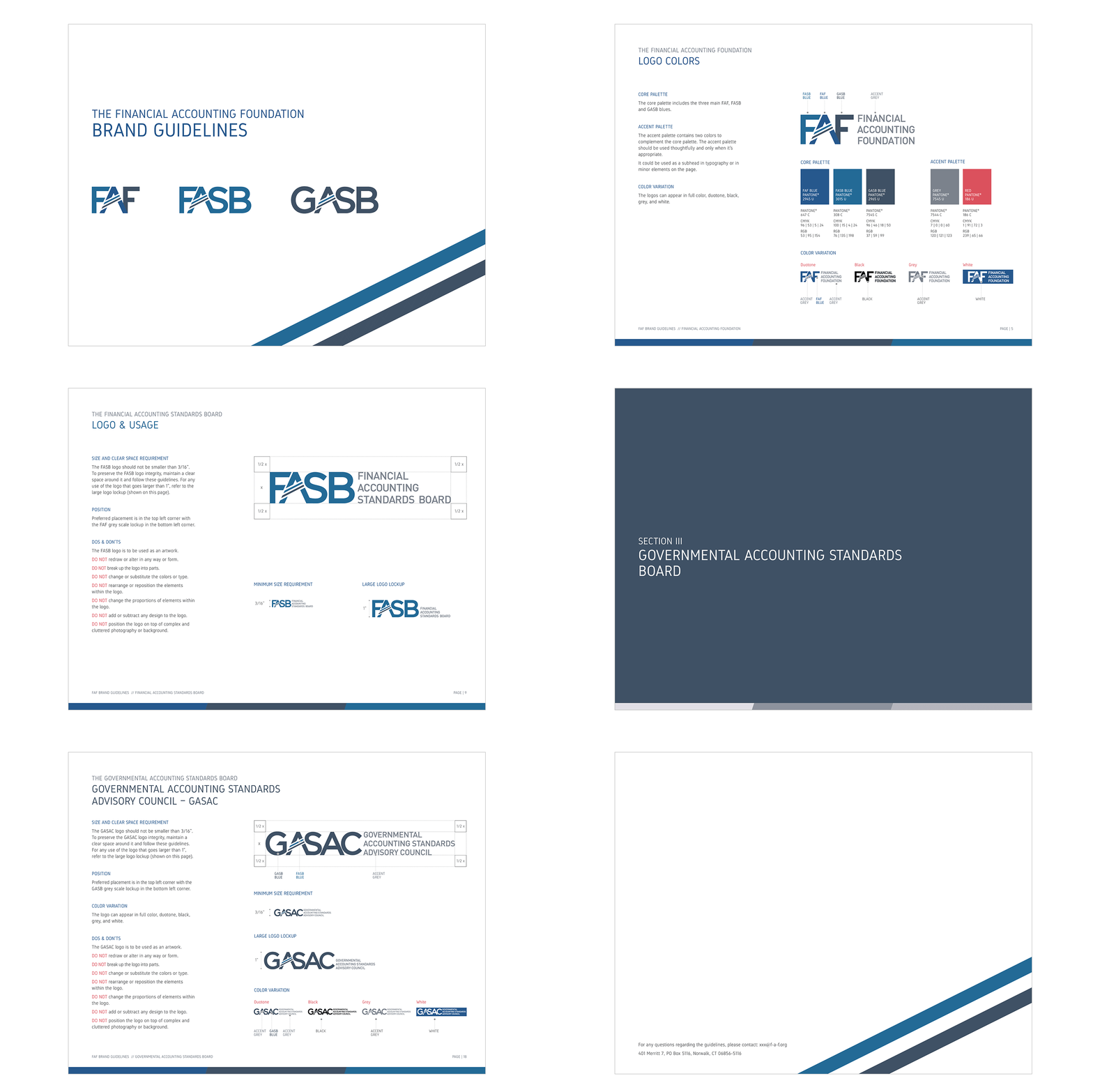
Established clear brand standards and usage rules that in-house teams could easily apply, helping create consistency across communication materials and everyday brand expression.
-

Website redesign
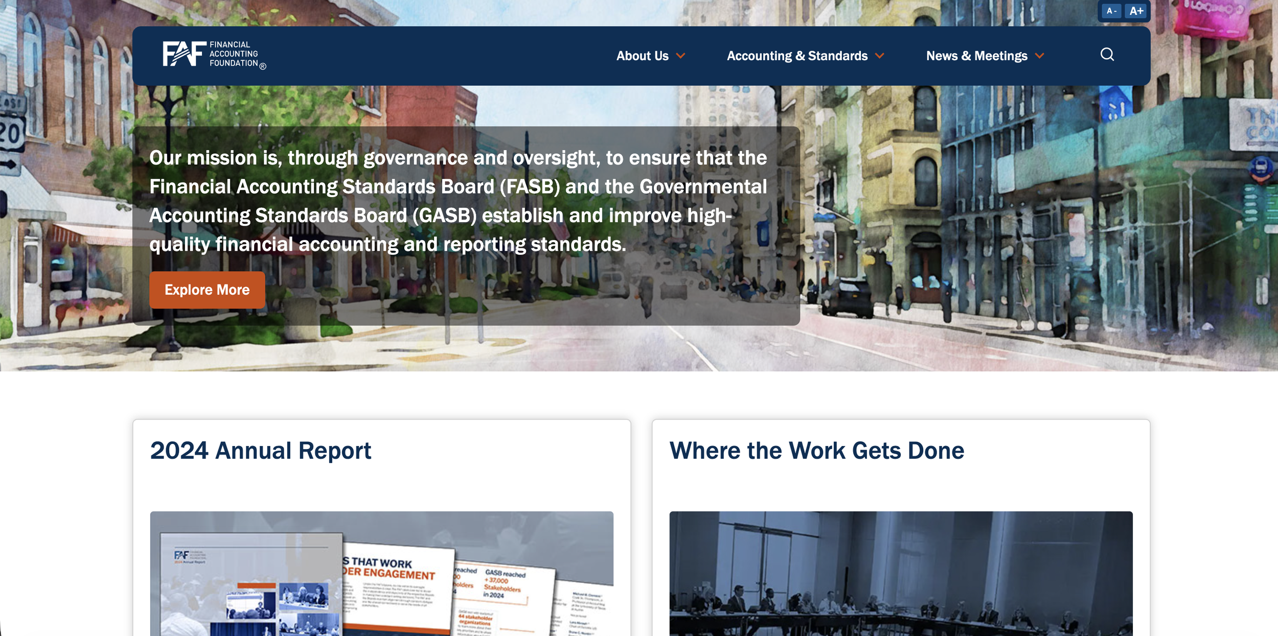
Redesigned the full website experience with an updated navigation system and a more cohesive structure, bringing the sub-brands into alignment with the main FAF brand.
-

Signage and way-finding system
Designed a branded signage and wayfinding system for the Connecticut and Washington, DC offices, helping unify the experience across corridors, floors, and key office touchpoints.
Want to see the complete case study?
LET’S GET STARTED